
Weather Heatmaps from the Wetterpark Offenbach
Published:
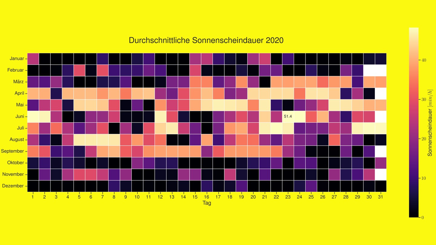
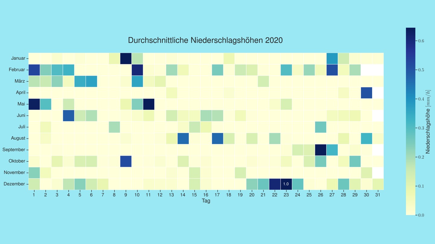
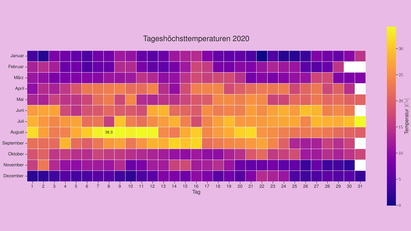
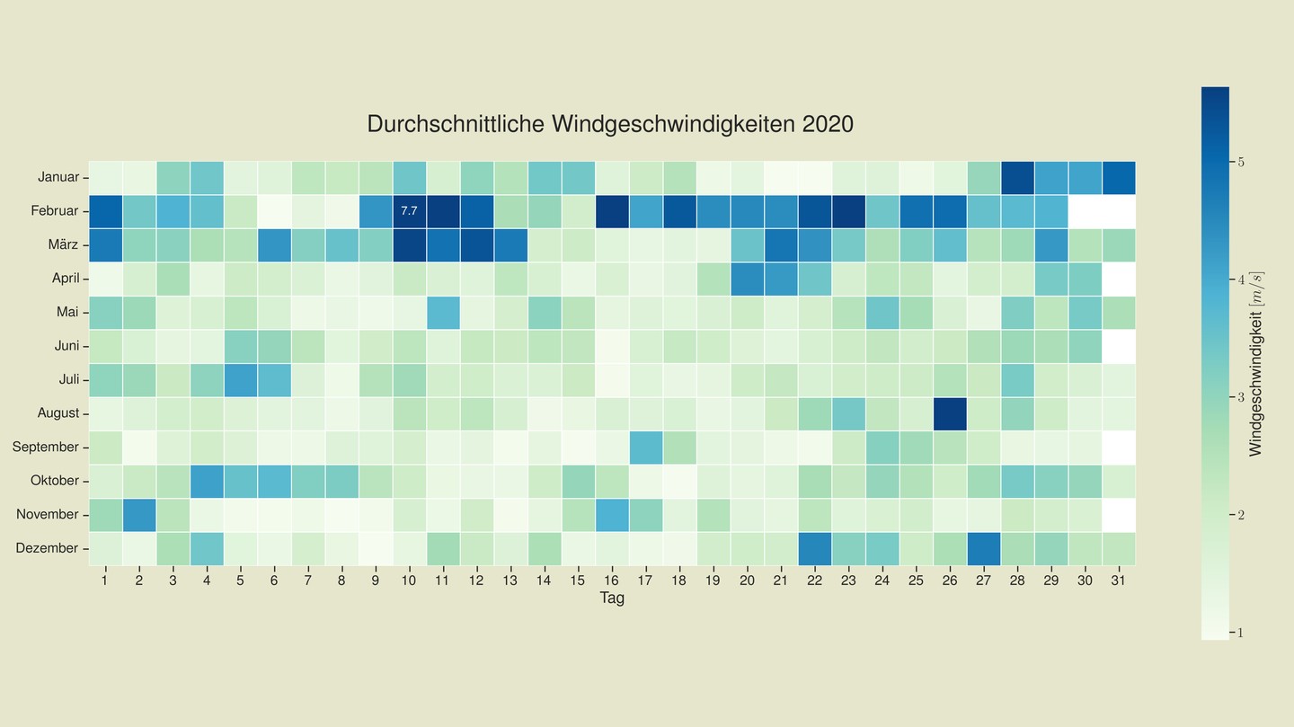
Four heatmaps covering a full year of weather data from the Wetterpark in Offenbach am Main (2020). Each cell is one day, each column is one month.
Observations
The temperature and sunshine plots don’t hold many surprises – summer is hot, winter is dark. More interesting: February and March are consistently windier than the rest of the year. The peak values for each variable are annotated in their respective cells.
Approach
The data from the DWD Climate Data Center is pivoted so that days are on one axis and months on the other, then plotted with Seaborn:
import seaborn as sns
import matplotlib.pyplot as plt
import pandas as pd

pivot = df.pivot(index='day', columns='month', values='temperature_max')

fig, ax = plt.subplots(figsize=(14, 10))
sns.heatmap(pivot, annot=True, fmt='.1f', cmap='RdYlBu_r', ax=ax)
Heatmaps work well here because you can immediately spot anomalies – a particularly dry April, an unusually warm November week – that would be harder to see in a line chart.